# The only accessible & unstyled & full featured Input OTP component in the Web.
### OTP Input for React 🔐 by [@guilhermerodz](https://twitter.com/guilherme_rodz)
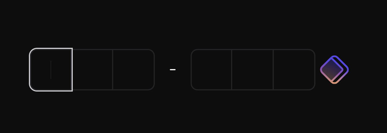
https://github.com/guilhermerodz/input-otp/assets/10366880/753751f5-eda8-4145-a4b9-7ef51ca5e453
## Usage
```bash
npm install input-otp
```
Then import the component.
```diff
+'use client'
+import { OTPInput } from 'input-otp'
function MyForm() {
return
}
```
## Default example
The example below uses `tailwindcss` `@shadcn/ui` `tailwind-merge` `clsx`:
```tsx
'use client'
import { OTPInput, SlotProps } from 'input-otp'
(
<>
{slots.slice(0, 3).map((slot, idx) => (
))}
{slots.slice(3).map((slot, idx) => (
))}
)}
/>
// Feel free to copy. Uses @shadcn/ui tailwind colors.
function Slot(props: SlotProps) {
return (
{props.char !== null &&
{props.char}
}
{props.hasFakeCaret &&
}
Supports iOS + Android copy-paste-cut
https://github.com/guilhermerodz/input-otp/assets/10366880/bdbdc96a-23da-4e89-bff8-990e6a1c4c23
Automatic OTP code retrieval from transport (e.g SMS)
By default, this input uses `autocomplete='one-timecode'` and it works as it's a single input.
https://github.com/guilhermerodz/input-otp/assets/10366880/5705dac6-9159-443b-9c27-b52e93c60ea8
Supports screen readers (a11y)
Stripe was my first inspiration to build this library.
Take a look at Stripe's input. The screen reader does not behave like it normally should on a normal single input.
That's because Stripe's solution is to render a 1-digit input with "clone-divs" rendering a single char per div.
https://github.com/guilhermerodz/input-otp/assets/10366880/3d127aef-147c-4f28-9f6c-57a357a802d0
So we're rendering a single input with invisible/transparent colors instead.
The screen reader now gets to read it, but there is no appearance. Feel free to build whatever UI you want:
https://github.com/guilhermerodz/input-otp/assets/10366880/718710f0-2198-418c-8fa0-46c05ae5475d
Supports all keybindings
Should be able to support all keybindings of a common text input as it's an input.
https://github.com/guilhermerodz/input-otp/assets/10366880/185985c0-af64-48eb-92f9-2e59be9eb78f
Automatically optimizes for password managers
For password managers such as LastPass, 1Password, Dashlane or Bitwarden, `input-otp` will automatically detect them in the page and increase input width by ~40px to trick the password manager's browser extension and prevent the badge from rendering to the last/right slot of the input.
 - **This feature is optional and it's enabled by default. You can disable this optimization by adding `pushPasswordManagerStrategy="none"`.**
- **This feature does not cause visible layout shift.**
### Auto tracks if the input has space in the right side for the badge
https://github.com/guilhermerodz/input-otp/assets/10366880/bf01af88-1f82-463e-adf4-54a737a92f59
- **This feature is optional and it's enabled by default. You can disable this optimization by adding `pushPasswordManagerStrategy="none"`.**
- **This feature does not cause visible layout shift.**
### Auto tracks if the input has space in the right side for the badge
https://github.com/guilhermerodz/input-otp/assets/10366880/bf01af88-1f82-463e-adf4-54a737a92f59
## API Reference
### OTPInput
The root container. Define settings for the input via props. Then, use the `render` prop to create the slots.
#### Props
```ts
type OTPInputProps = {
// The number of slots
maxLength: number
// Render function creating the slots
render: (props: RenderProps) => React.ReactElement
// PS: Render prop is mandatory, except in cases
// you'd like to consume the original Context API.
// (search for Context in this docs)
// The class name for the root container
containerClassName?: string
// Value state controlling the input
value?: string
// Setter for the controlled value (or callback for uncontrolled value)
onChange?: (newValue: string) => unknown
// Callback when the input is complete
onComplete?: (...args: any[]) => unknown
// Where is the text located within the input
// Affects click-holding or long-press behavior
// Default: 'left'
textAlign?: 'left' | 'center' | 'right'
// Virtual keyboard appearance on mobile
// Default: 'numeric'
inputMode?: 'numeric' | 'text' | 'decimal' | 'tel' | 'search' | 'email' | 'url'
// Enabled by default, it's an optional
// strategy for detecting Password Managers
// in the page and then shifting their
// badges to the right side, outside the input.
pushPasswordManagerStrategy?:
| 'increase-width'
| 'none'
// Enabled by default, it's an optional
// fallback for pages without JS.
// This is a CSS string. Write your own
// rules that will be applied as soon as
// 

